Create Your First Project
Start adding your projects to your portfolio. Click on "Manage Projects" to get started


TinyTrack App
User Research
I conducted user interviews, which I then turned into empathy maps to better understand the target user and their needs. I learned that many users are enthusiastic about the arts and would love to be more involved in their local art museum, and arts community as a whole. However, finding information about art events and exhibitions is sometimes very difficult and they have to search multiple sources to find what they are looking for. This can be frustrating and sometimes results in them giving up on the process. They also want to be able to book viewings and register for events quickly and easily from their computers or phones.
Pain Points

Limited Time
Many of our users expressed that they are very busy and would like the booking process to be quick and easy. We will take this into account by designing a streamlined booking and checkout process on the website.

Information hard to find
Several of our users said that they are frustrated that they have to do a lot of searching to find information on art events happening in their community. We will address this by creating an event calendar that includes other events happening in the community.

Hard to navigate
Some users expressed difficulty with navigating new websites . We will try to ensure our design is easy to navigate with bright, clear buttons and guiding language to make their experience seamless.
Persona: Nadia
Age: 37
Occupation: Teacher
Family: Young Daughter
Problem statement:
Nadia is a busy mom and educator who needs to book viewing appointments easily because her schedule is often very tight
Goals:
She wants a fast and easy way to see what is being exhibited and to book viewing appointments without having to make phone calls
Frustrations:
She feels as though she wastes time browsing websites and community forums to find out what events and exhibitions are happening in her area
I created a user journey map of Nadia’s process in using the website to help understand her experience and identify any possible roadblocks or areas for improvement
.png](https://static.wixstatic.com/media/ed216c_cc7a89d6f1074cdebdb47b28f5d689f9~mv2.png/v1/fill/w_462,h_262,al_c,q_85,usm_0.66_1.00_0.01,enc_avif,quality_auto/Google%20UX%20Design%20Certificate%20-%20User%20Journey%20Map%20%5BTemplate%5D(1).png)
Starting the Design
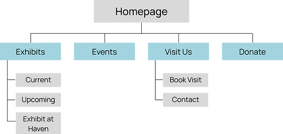
Sitemap
Difficulty with navigation and limited time available were main pain points with my users so I aimed to make this sitemap simple and easy to navigate
My goal was to have the information architecture organized in a way that also helped to alleviate these pain points
Paper Wireframes
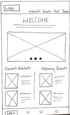
In drawing my paper wireframes, I hoped to get an initial idea of the design and map out the pain points I needed it to address. In this wireframe of the homepage, my aim was to include all of the information users needed to see when they landed on the website so they didn't have to work hard to get where they wanted to go.


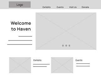
Because Haven Art Museum’s patrons access the site on a variety of different devices, I started to work on designs for additional screen sizes to make sure the site would be fully responsive.
Digital Wireframes

Based on our users needs, I mapped out a calendar on the events page so finding arts events was very easy. It was important that navigation was intuitive and so I used large buttons (e.g. Book Event) on pages so next steps in the user flow were clear.


Screen size variations of the home screen for tablet and mobile
Usability Study
Study Type: Unmoderated usability study
Location: Canada, remote
Participants: 5 participants
Duration: 10-15 minutes
These were the main findings from my usability study:
Navigation to booking
Need a more direct path to booking page from home page
Event info
It was confusing to know where to click to bring you to particular event information (image was the only thing clickable)
Checkout
Total amount was hard to see and should have been more prominent
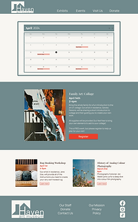
Refining the Design
Mockups
Based on learnings from the usability study, I needed to make sure the path to the booking page was much clearer. I added a large button on the homepage to make this flow more smoothly.
Before usability study
After usability study

The usability study also showed that the checkout page needed to be reworked. Users said that the total wasn’t easily seen so I addressed that in the mockup by making it more prominent. I also rearranged it a little to make the flow better.
Before usability study

After usability study


Accessibility Considerations
I used headings with different sized text for clear visual hierarchy
I used labels to help users navigate the site, including users who rely on assistive technologies
Total amount was hard to see and should have been more prominent